¶ BUILDING DEPENDENCIES BETWEEN INDICATORS
¶ Comparing two groups based on quantitative characteristics
To build dependencies, you need to define dependent and independent indicators. For example, if the task is to compare blood pressure in smokers and non-smokers, then the dependent indicator is systolic blood pressure (SBP), and the independent indicator is smoking status.
The analysis starts with the independent indicator, in our case, the “Smoking” column. In the database, click on the gear icon in the required column  and go to the “Dependencies” tab (Fig. 1).
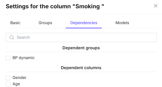
Figure 1 - “Dependencies” tab in the column settings
This tab will display two sections: “Dependent groups”, if groups have been created, and “Dependent columns”.
To compare “SAD” depending on smoking status, check the “SAD” column in the “Dependent Columns” section. After selecting the dependent column, click the “OK” button. (Fig. 2).
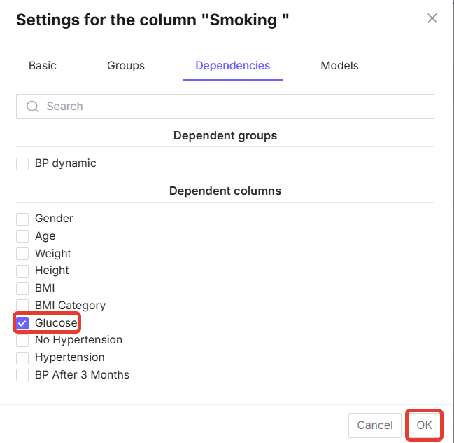
Figure 2 - Dependent indicator selection function
To obtain the analysis results, click the “Perform analysis” button in the upper right corner (Fig. 3).
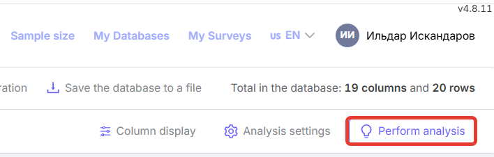
Figure 3 - “Run analysis” button
After that, the completed analysis will appear on the right side of the screen (Fig. 4).
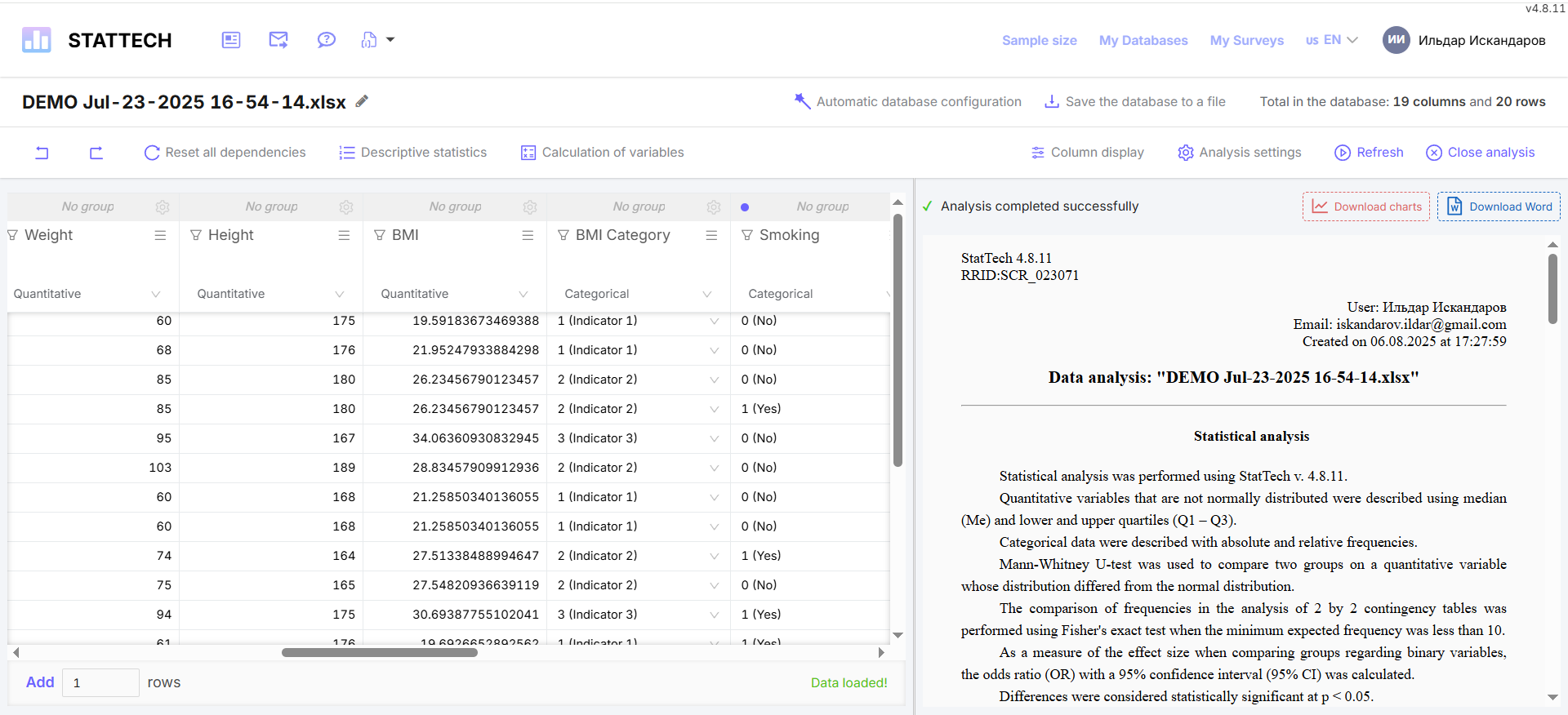
Figure 4 - Data analysis generated in StatTech
The results can be downloaded in .DOCX (MS Word) format by clicking on the corresponding button (Fig. 5).
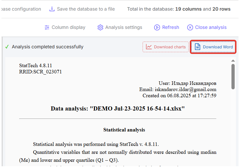
Figure 5 - “Download Word” button in the generated data analysis
It is also possible to download high-resolution graphs by clicking the corresponding button. The charts are downloaded in a single archive with the .ZIP extension (Fig. 6).
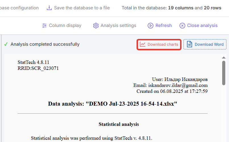
Figure 6 - “Download charts” button in the generated data analysis
¶ General structure of the analysis results
The data analysis result consists of several parts:
- Description of statistical analysis methods (Fig. 7);
- Table with analysis of indicator dependencies;
- Conclusion based on the results of the analysis of indicator dependencies, indicating the method used;
- Diagram.
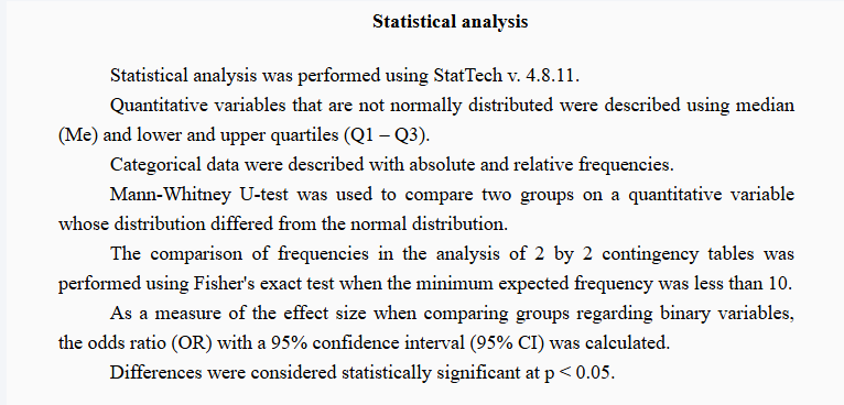
Figure 7 - Example of a description of statistical analysis methods
Statistical analysis data is displayed in a table (Fig. 8). Tables and diagrams in the generated analysis are numbered sequentially.
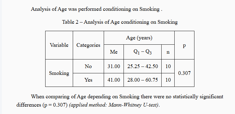
Figure 8 - Example of statistical analysis of the “SAD” indicator depending on smoking
A diagram is displayed below the table (Fig. 9). Depending on the distribution, you can see either an intra-column diagram or a box diagram.
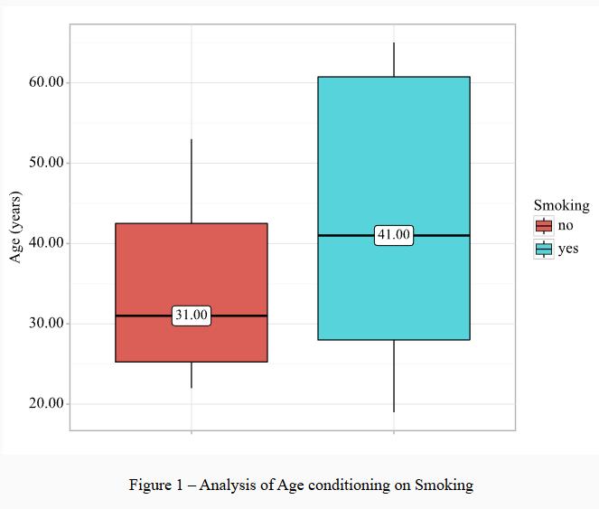
Figure 9 - Example of a diagram in statistical analysis
¶ Comparison of two groups by categorical feature
First, you need to define the dependent and independent indicators. For example, if we consider the presence of arterial hypertension (AH) depending on smoking, then the dependent indicator is the presence of AH, and the independent indicator is the presence of smoking.
The analysis starts with the independent variable. In the database, click on the gear icon in the required column and go to the “Dependencies” tab (Fig. 1).
To compare “Presence of AH” depending on smoking, you need to check the “Presence of AH” column in the “Dependent Columns” section. After selecting the dependent column, click the “OK” button. (Fig. 10).
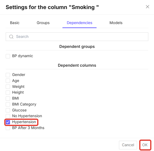
Figure 10 - Dependent indicator selection function
To obtain the analysis results, click the “Perform analysis” button in the upper right corner (Fig. 3).
After that, the completed analysis will appear on the right side of the screen (Fig. 4).
Since we analyzed the dependence of one categorical feature on another, the methods and means of description used will differ from the analysis of quantitative indicators (Fig. 11).
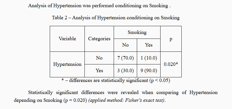
Figure 11 - Example of the output of the statistical analysis “Presence of AH” depending on smoking
Below the conclusion, you can see a diagram with the calculation of the odds of “presence of AH” depending on smoking (Fig. 12).
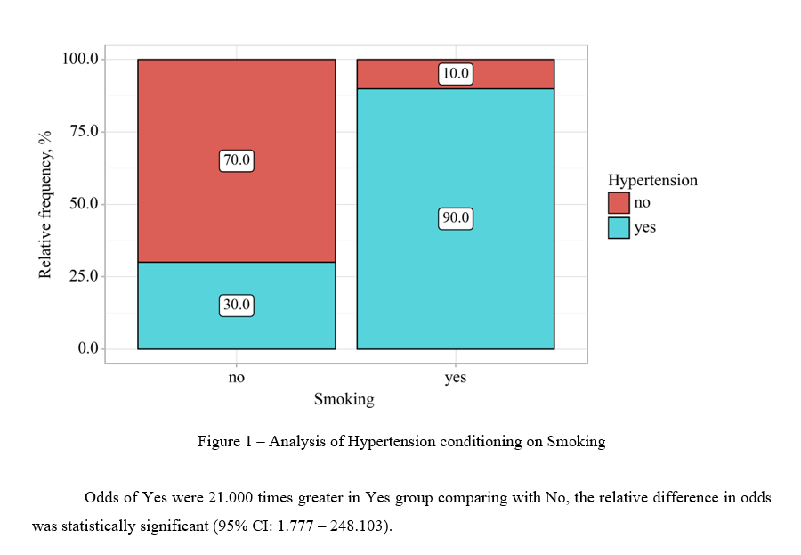
Figure 12 - Example of a diagram and conclusion in the generated analysis
¶ Comparing three or more groups by quantitative criteria
First, you need to determine the dependent and independent indicators. For example, if we consider body mass index (BMI) depending on blood pressure, then the dependent indicator is systolic blood pressure (SBP), and the independent indicator is BMI.
In order to construct the dependence of the body mass index, the column with BMI values must be converted by assigning each value its own degree (see Section Setting Up Columns).
The analysis starts from the independent indicator. In the database, click the gear icon in the required column and go to the “Dependencies” tab (Fig. 1).
To compare “SAD” depending on the degree of BMI, you need to check the “SAD” column in the “Dependent Columns” section. After selecting the dependent column, click the “OK” button (Fig. 2).
To get the analysis results, click the “Run Analysis” button in the upper right corner (Fig. 3).
After that, the completed analysis will appear on the right side of the screen (Fig. 4).
Due to the fact that we analyzed the dependence of several groups on a quantitative characteristic, the methods and means of description used will differ from the analysis of other indicators (Fig. 13).
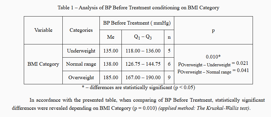
Figure 13 - Example of a comparison of three groups by quantitative characteristics
After the analysis results, you can see a diagram displaying statistical data (Fig. 14).
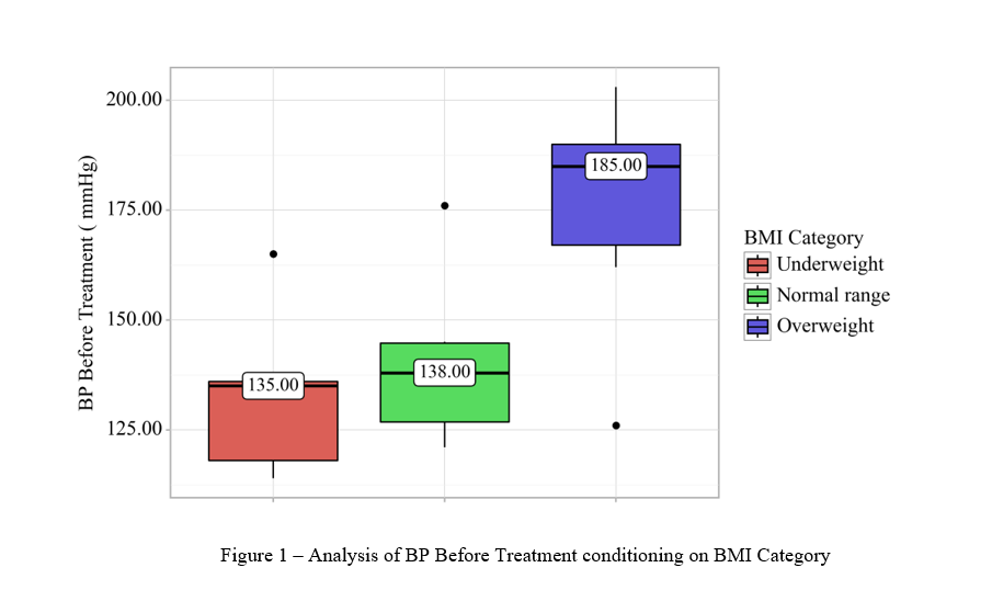
Figure 14 - Example of a graph comparing three groups by quantitative attribute
¶ Comparing three or more groups by categorical attribute
First, you need to determine the dependent and independent indicators. For example, if we consider the degree of body mass index (BMI) depending on the presence of arterial hypertension, then the dependent indicator is the presence of arterial hypertension (“Presence of AH”), and the independent indicator is the degree of BMI.
In order to construct the dependence of the body mass index, the column with BMI values must be converted by assigning each value its own degree (see Section Setting Up Columns).
The analysis starts with the independent indicator. In the database, click the gear icon in the required column and go to the “Dependencies” tab (Fig. 1).
To compare “Presence of AH” depending on the degree of BMI, you need to check the “Presence of AH” column in the “Dependent Columns” section. After selecting the dependent column, click the “OK” button (Fig. 10).
To obtain the analysis results, click the “Perform analysis” button in the upper right corner (Fig. 3).
After that, the completed analysis will appear on the right side of the screen (Fig. 4).
Since we analyzed the dependence of several groups by categorical feature, the methods and means of description used will differ from the analysis of other indicators (Fig. 15).
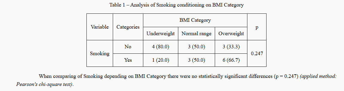
Figure 15 - Example of comparing three groups by categorical feature
After the analysis results, you can see a diagram displaying statistical data (Fig. 16).
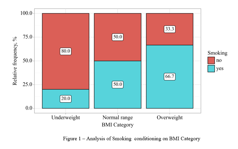
Figure 16 - Example of a graph comparing three groups by categorical feature
¶ Correlation analysis
To perform a correlation analysis, let's take the relationship between blood pressure (SBP) and age. Both indicators are quantitative variables.
To construct dependencies, it is necessary to determine the dependent and independent indicators. In this case, the dependent indicator is systolic blood pressure (SBP), and the independent indicator is age.
In the database, click on the gear icon in the dependent column and go to the “Dependencies” tab (Fig. 1).
To compare SBP depending on age, you need to check the SBP column in the “Dependent Columns” section. After selecting the dependent column, click the “OK” button (Fig. 2).
To obtain the analysis results, click the “Perform Analysis” button in the upper right corner (Fig. 3).
After that, the completed analysis will appear on the right side of the screen (Fig. 4).
The output of the correlation analysis will depend on the distribution of indicators (normal and “abnormal”) (Fig. 17 and Fig. 18).

Figure 17 - Example of correlation analysis results for “abnormal” distribution
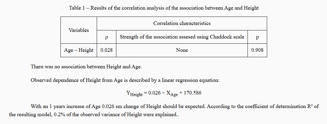
Figure 17 - Example of correlation analysis results for a normal distribution
After the analysis results, you can see a diagram displaying statistical data (Fig. 18).
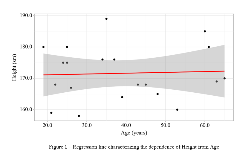
Figure 18 - Example of a regression function graph
¶ Roc - Analysis
ROC analysis is used to assess the diagnostic significance of quantitative characteristics in predicting a specific outcome.
For example, let's take the dependence of blood pressure (SBP) on gender.
To construct dependencies, it is necessary to determine the dependent and independent indicators. In this case, the dependent indicator is systolic blood pressure (SBP), and the independent indicator is gender.
In the database, click on the gear icon in the dependent column and go to the “Dependencies” tab (Fig. 1).
To compare SBP depending on gender, you need to check the SBP column in the “Dependent Columns” section. After selecting the dependent column, click the “OK” button (Fig. 2).
To obtain the analysis results, click the “Perform Analysis” button in the upper right corner (Fig. 3).
After that, the completed analysis will appear on the right side of the screen (Fig. 4).
The ROC analysis template differs in structure from other types of constructing dependencies between indicators. The structure of the completed ROC analysis consists of:
- Description of statistical analysis methods (Fig. 19).
Figure 19 - Example of a description of statistical data analysis methods
- Table of indicator analysis (Fig. 20).
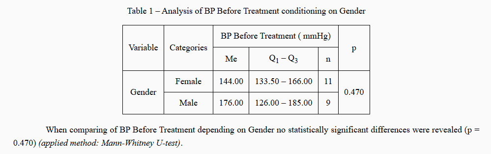
Figure 20 - Example of a tabular form of indicator analysis
- Indicator analysis diagram (Fig. 21).
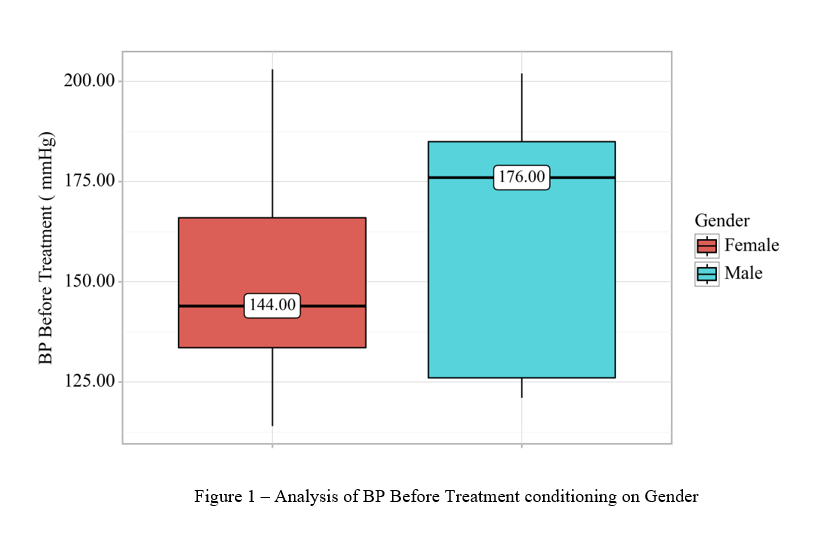
Figure 21 - Example of a chart for analyzing indicators
- ROC curve (Fig. 22).
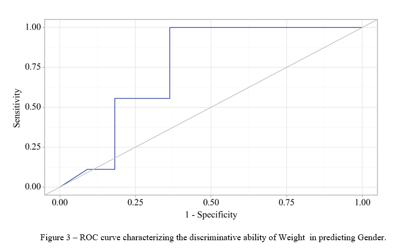
Figure 22 - Example of a ROC curve
- Specificity and sensitivity graph (Fig. 23).
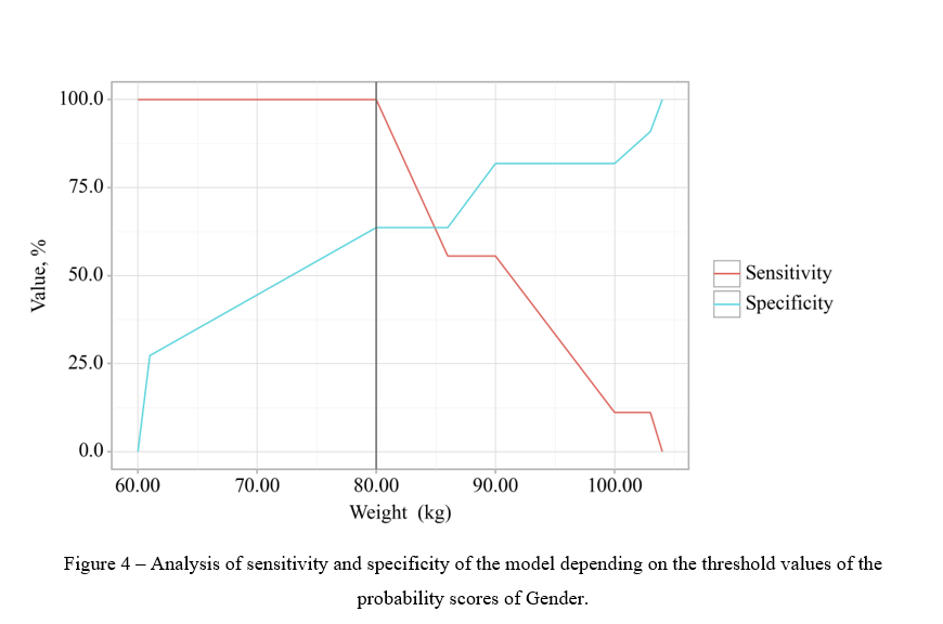
Figure 23 - Example of a graph analyzing the specificity and sensitivity of the model
- Table for calculating threshold values. PPV. NPV. (Fig. 24).
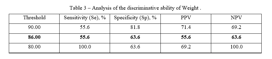
Figure 24 - Example of threshold values
- Conclusion (Fig. 25).
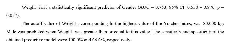
Figure 25 - Example of ROC analysis output
¶ Analysis of data in the “Before - After” format
¶ Comparing indicators in “Before - After” format without dividing into groups
In order to analyze two indicators in the “Before - After” format, you need to create a group of indicators (see Section Setting Up Columns). Assign the necessary columns to this group. For example, let's take the blood pressure indicators before and after treatment (Fig. 26).

Figure 26 - Example of assigning indicators to groups in the “Before - After” format
After the necessary indicators have been assigned to groups, click the “Perform analysis” button in the upper right corner of the screen (Fig. 27).
Figure 27 - “Perform analysis” button
After that, the completed analysis will appear on the right side of the screen (Fig. 28).
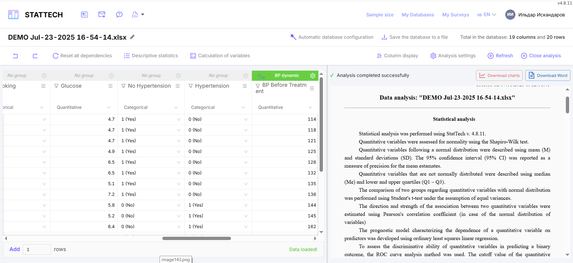
Figure 28 - Example of generated data analysis
The options for the generated analysis of indicators in the “Before - After” format will depend on the normality of the distribution, due to the use of different criteria for analyzing indicators. The structure of the analysis itself remains unchanged: a description of the statistical analysis methods, a data analysis table, conclusions based on the results of the analysis of indicators with an indication of the method used, and a diagram.
- With an “abnormal” data distribution, the data analysis table will look as follows (Fig. 29).
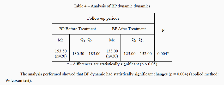
Figure 29 - Example of a tabular form of “Before - After” data analysis > with “abnormal” distribution
The diagram for this distribution will look as follows (Fig. 30).
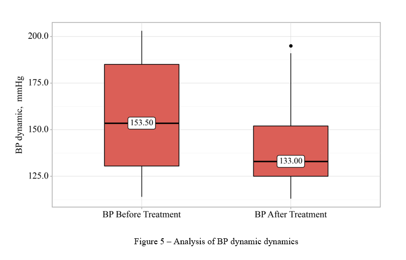
Figure 30 - Example of a “Before - After” indicator analysis chart with “abnormal” distribution
- With normal data distribution, the data analysis table will look as follows (Fig. 31).
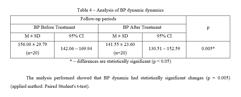
Figure 31 - Example of a tabular form of “Before - After” data analysis > with normal distribution
The diagram for this distribution will look as follows (Fig. 32).
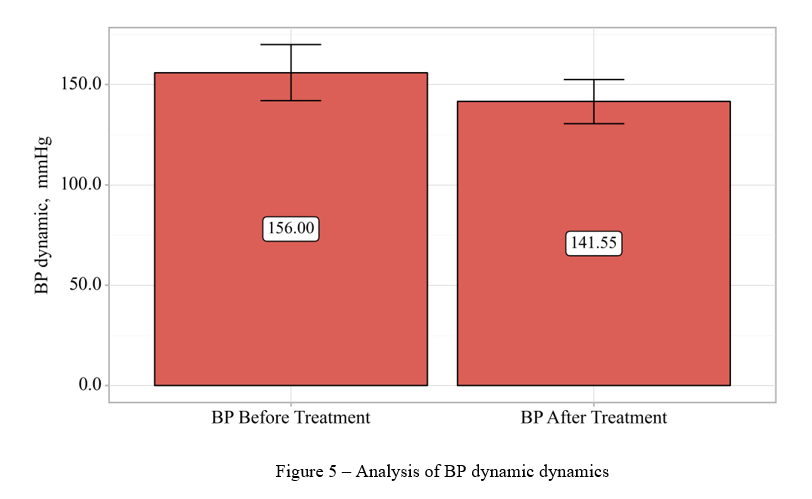
Figure 32 - Example of a “Before - After” indicator analysis chart with normal distribution
¶ Comparison of indicators in “Before - After” format with division into groups
In order to analyze two indicators in the “Before - After” format, it is necessary to create a group of indicators (see Section Setting Up Columns). Assign the necessary columns to this group. For example, let's take the blood pressure (BP) indicators before and after treatment (Fig. 26). Let's build a relationship between BP and treatment with drugs.
To do this, we need to go to the column settings for the “Drug” column by clicking on the  sign. Go to the “Relationships” tab. (Fig. 33).
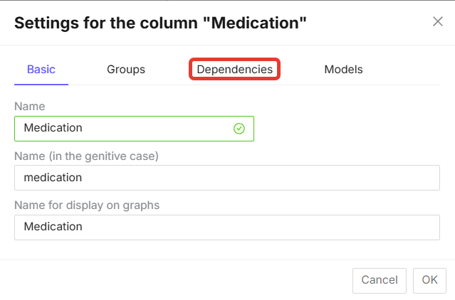
Medication 7.33 - “Dependencies” tab in the column settings
On the “Dependencies” tab, select “Dependent groups”, check the required group - “AD in dynamics” and click on the “OK” button (Fig. 34).
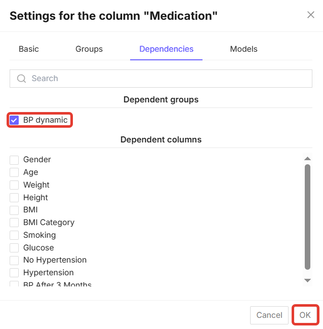
Figure 34 - Selecting a dependent group in the column settings
After these steps, click the “Run Analysis” button in the upper left corner of the screen (Fig. 27).
The structure of the data analysis will also depend on the distribution of data in the columns being analyzed.
- An example of data analysis with an “abnormal” distribution is shown below. The data analysis structure will also consist of a description of statistical analysis methods (Fig. 35), a data analysis table (Fig. 36), conclusions based on the analysis results with an indication of the method used (Fig. 37), and diagrams (Fig. 38).
Figure 35 - Example of a description of statistical analysis methods
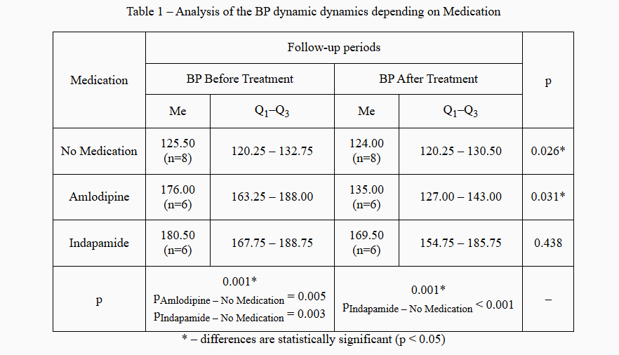
Figure 36 - Example of a tabular form of indicator analysis for “abnormal” distribution
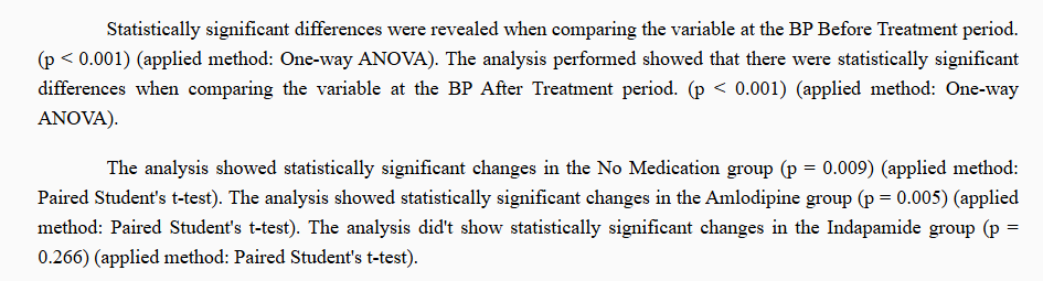
Figure 37 - Example of conclusions based on data analysis results for “abnormal” distribution
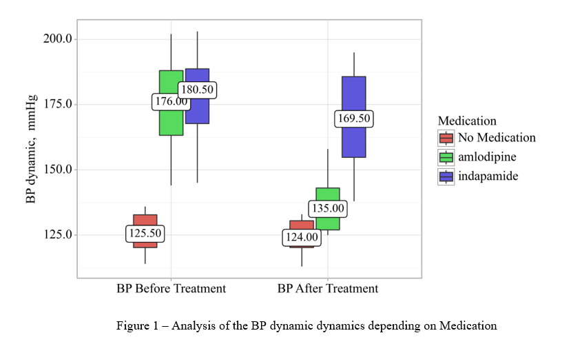
Figure 38 - Example of a data analysis chart for “abnormal” distribution
- Data analysis for a normal distribution will differ in terms of the criteria used to compare indicators. The type of diagram (Fig. 40) and the data analysis table (Fig. 39).

Figure 39 - Example of a tabular form of data analysis for normal distribution
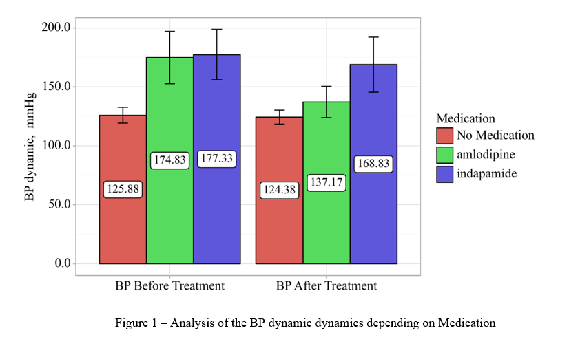
Figure 40 - Example of a data analysis chart for normal distribution
¶ Comparing three or more indicators in a “Before - After” format
To analyze three or more indicators in a “Before - After” format, you need to create a group of indicators (see Section Setting Up Columns). Assign the necessary columns to this group. For example, let's take blood pressure indicators before/after treatment/after 3 months (Fig. 41).
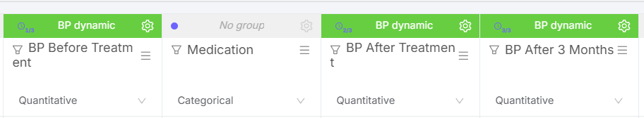
Figure 41 - Example of distributing indicators to groups in the “Before - After” format
After the necessary indicators have been assigned to groups, click the “Perform analysis” button in the upper right corner of the screen (Fig. 42).
Figure 42 - “Perform analysis” button
The structure of the analysis will have standard sections:
- Description of statistical analysis methods;
- Table of indicator analysis with calculations;
- Conclusions to the table;
- Diagram.
When analyzing the normal distribution of quantitative data in dynamics when evaluating three or more indicators, a scatter plot is constructed instead of a bar chart (Fig. 43).
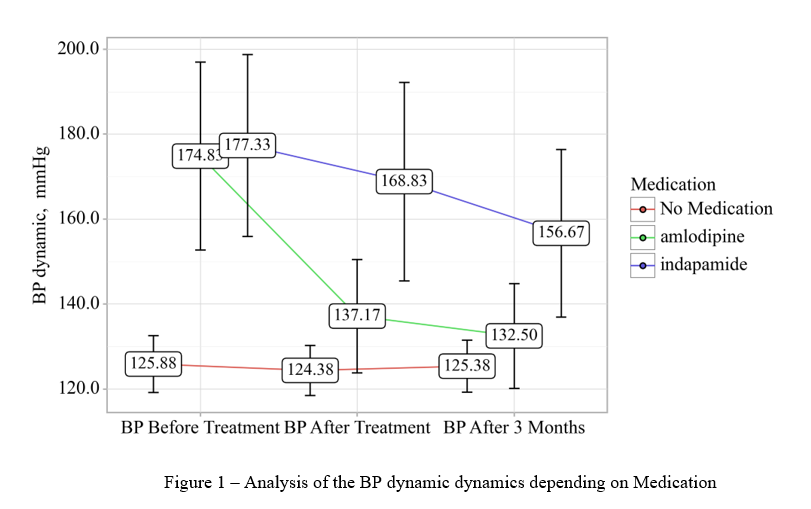
Figure 43 - Example of a scatter plot when analyzing three indicators in dynamics